Module 3 Outline

Module Overview
In this module, you’ll get answers to questions like:
- How does the layout of a document or webpage affect your reader’s understanding of it?
- What do readers see first when they look at a document?
- How can layout help hook your audience and keep them reading?
Introductory Video
Learning Objectives
After this course, you’ll be better able to:
- Organize your work so readers will understand it quickly
- “Chunk” information, so it’s easier for readers to process
- Make documents clearer with headers, bullets, and white space
Does format and layout matter?
If you’re a health communicator, how much do format and layout really matter?
Why Format and Layout Matter
They matter a lot. They’re not superficial. They’re not afterthoughts. They’re an essential part of your work.
A bad design can undermine your message. Your readers may be so confused by your organization — or turned off by how it looks — that they stop reading altogether.
Good Design Helps Your Readers
Health information can be hard to understand — even if it’s in plain language. That’s why good organization and layout is so crucial. Good design eases the burden on your readers by:
- Presenting information in a familiar, predictable way
- Distinguishing key ideas visually — with short chunks of text
- Showing your reader what to expect at a glance
Scanning vs. Reading
When you’re planning the layout of your piece, consider how people first approach a webpage or material.
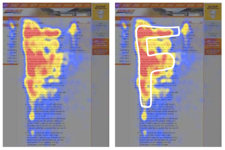
They won’t read it — at least not methodically. Instead, they’ll quickly scan the whole document. We know this from eye-tracking studies, which record where a reader looks on a screen or page.
What Your Reader Will See
Want to see what your readers will take in (roughly) when they first scan a new page?
Take a look at this image from an eye tracking study conducted by the Nielsen Norman Group. Those sections in red are what readers focus on first. Based on what they find there, they’ll decide whether to read the whole thing or not.
Source: Nielsen, J. (2006, April 17). F-shaped pattern for reading web content. Retrieved November 4, 2014, from http://www.nngroup.com/articles/f-shaped-pattern-reading-web-content/
The F Pattern
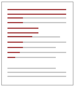
Most readers scan in a particular pattern — it looks like the capital letter F.
- They read the first few lines at the top (the horizontal top of the F).
- They move down the page a bit and read across again (the middle line of the F)
- They scan down the left edge, reading only the first few words of each line (the vertical line of the F).
Use the F Pattern to Your Advantage
Use your knowledge of the F-pattern when you’re laying out your work. Position crucial information so that readers will see it when they scan.
The Wall of the Words
Here’s an example of something you don’t want in your work.
You may be exposed to chlorine through breathing, skin and eye contact if an accident involving chlorine takes place nearby, such as a liquid chlorine spill, a leak from a chlorine tank, or a leak from a facility that produces or uses chlorine. You may also be exposed to chlorine if you mix household chemicals such as toilet cleaner with bleach. Mixing household cleaners containing ammonia with bleach may also release dangerous chemicals into the air. You may be exposed to chlorine gas through the improper use of swimming pool chemicals. People who work in places where chlorine is made or used may be exposed to low levels over a period of time. Do not mix bleach with other household cleaners such as toilet cleaners because chlorine gas can be released to the air. Do not mix bleach with household cleaners containing ammonia because dangerous chemicals can be released to the air. Always store household chemicals in their original labeled containers out of reach of young children to prevent accidental poisonings. Never store household chemicals in containers children would find attractive to eat or drink from, such as old soda bottles. Chlorine gas can also be released to the air when chemicals used to chlorinate swimming pools are mishandled. If you have a swimming pool at home, read the labels of the chlorination products carefully and do not let children play with these products.
Nobody can scan a big block of text like this. It’s uninviting and intimidating. The wall of words can scare your readers off — before they have a chance to understand what you’re trying to tell them. If you bury an important point in the center of a block of text, your reader will probably never see it. The following section will show you ways to avoid the wall of words.
Chunk Your Text
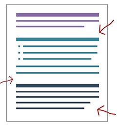
Chunking is an important way to create a clear, clean look — and avoid a wall of words. It just means splitting up content in to smaller, sensible sections, like a short paragraph or a few bullets. It’s a way of visually showing a single main message along with a few details to support it.
Source: Simply Put: A guide for creating easy-to-understand materials. (2009, April 1). Retrieved November 4, 2014 from https://www.cdc.gov/healthliteracy/pdf/simply_put.pdf
Add White Space
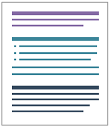
Notice how the page uses white space to set apart chunks. White space is just that — blank, empty space. It’s essential for a good layout.
You can say a lot with nothing. White space gives your words some breathing room. An uncluttered layout is inviting — it pulls your readers in.
Source: Simply Put: A guide for creating easy-to-understand materials. (2009, April 1). Retrieved November 4, 2014 from https://www.cdc.gov/healthliteracy/pdf/simply_put.pdf
Use Headers
Good headers are key to effective chunking. They’re like a map for your readers. At a glance, people will see what’s coming up and know where to find what they need.
But confusing, bland headers can give the wrong impression — or be so boring that they don’t draw a reader in.
Source: McGee, J. (n.d.). Toolkit for making written material clear and effective. Part 4, 29. Retrieved November 13, 2014 from https://www.cms.gov/Outreach-and-Education/Outreach/WrittenMaterialsToolkit/ToolkitPart04.html
Fix These Headers
Dichlorodiphenyltrichloroethane Info
- DDT (dichlorodiphenyltrichloroethane) is a pesticide once widely used to control insects on farms.
- DDT is usually a powder.
- DDT is banned in the U.S., but people in other countries still use it.
Two Different Things about DDT That Consumers Might Want to Be Aware of
- Foods from countries that still allow the use of DDT may carry DDT.
- You can absorb DDT by breathing air or drinking water near waste sites with high levels of DDT.
What is DDT?
- DDT (dichlorodiphenyltrichloroethane) is a pesticide once widely used to control insects on farms.
- DDT is usually a powder.
- DDT is banned in the U.S., but people in other countries still use it.
How could I come in contact with DDT?
- Foods from countries that still allow the use of DDT may carry DDT.
- You can absorb DDT by breathing air or drinking water near waste sites with high levels of DDT.
Add Bullets
Bullets
Bullets are another good way to organize information. But don’t overdo it. If you have too many, your readers won’t be able to scan them.
If you need to have a long list of bullets, break them up into easy-to-read chunks with subheads.
See this before and after example. Notice how the sub-bullets make the layout more cluttered and harder to scan — avoiding them makes it cleaner.
Key Facts About Cadmium
- Cadmium is a metal that comes from the earth.
- Pure cadmium is a soft, silver-white metal.
- We use cadmium in making:
- Batteries
- Pigments
- Coatings
- Stabilizers for plastics
- Breathing air with cadmium can seriously harm your
- Lungs
- Kidneys
- Eating food or drinking water with very high cadmium levels is very dangerous.
- Contact with low levels of cadmium can make your bones weak.
What is cadmium
- Pure cadmium is a soft, silver-white metal.
- Cadmium comes from the earth.
- We use cadmium in making batteries, pigments, coatings, and stabilizers for plastics.
How could cadmium affect my health?
- Breathing air with cadmium can seriously harm your lungs and kidneys.
- Eating food or drinking water with very high cadmium levels is very dangerous.
- Contact with low levels of cadmium can make your bones weak.
Source: Simply Put: A guide for creating easy-to-understand materials. (2009, April 1). Retrieved November 4, 2014 from https://www.cdc.gov/healthliteracy/pdf/simply_put.pdf
Use Numbers
Using a numbered list is good too. But only use numbers if you’re trying to imply
- Sequence (like steps you should take or the order of items on an agenda)
- Ranking (like a top 10 list)
- Emphasis (like 2 goals you want to call out)
Otherwise, use bullets.
Source: Use lists. (n.d.). Retrieved November 4, 2014 from http://www.plainlanguage.gov/howto/guidelines/FederalPLGuidelines/writeLists.cfm
Help Your Reader Understand
Chunking your text — and using clear headers, bullets, and white space effectively — will not only make your layout look good, they'll improve your reader’s understanding as well.
Why? Because our brains can only process a small amount of information at a time.
Chunking helps by doing some of your readers’ work for them — presenting information so it’s already logically grouped (and distinguished from other chunks).
Add Emphasis
Add Emphasis
Don’t Use All Caps!
WHEN YOU WRITE IN ALL CAPS, IT TAKES MORE WORK FOR YOUR READER TO RECOGNIZE INDIVIDUAL LETTERS BECAUSE THEY’RE ALL IN THE SAME BOXY SHAPE.
And in email, all caps makes it seem like you’re SCREAMING. Don’t scream at your colleagues.
How to Choose a Font
There’s no best font. The most important thing is to use a font your reader’s familiar with. Unusual fonts will distract your reader and slow down their reading.
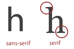
Studies show that sans-serif fonts — ones without a serif (the little line coming off the ends of the letter) — are easier to read on the web.
The CDC website users Lato font, and Arial and Calibri are other good options.
Consider 12 point as a minimum font size and 16 point for web, although the best size can vary depending on the font.
Use Colors Strategically
Choose Colors Carefully
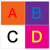
While loud colors get attention, they can be a lot harder to read. Use colors strategically, but don’t go overboard. In printed documents, color can seem noisy but unimportant — like junk mail or the leaflets that people leave on your car’s windshield.
Don’t Try to Squeeze in Everything
Sometimes, the constraints of your material’s layout can make it hard for you to state everything you want to say. What can you do?
Well, you could cram in that point if you:
- Reduce your margins
- Squeezeyourtexttogether
- Shrink your font
But often, the best move is to leave it out. If you squeeze in too much, your document will look less inviting, and that means people may not want to read it at all.
Improve Your Design
Good format and layout are essential. But to make your work even more effective, consider the overall design — using images, infographics, and other design elements to reinforce your message.
Final Thoughts
Remember that design is a key component of any health material. It’s not something to save for the end, like a spellcheck. Format and layout need to be a key consideration as you write. The better your layout and design, the more likely your audience will read, understand, and remember what you wrote.
Congratulations!
You’ve finished the second testing module. Take what you've learned with you.
You can also take the other 2 modules in the series:
